- 1) Challenge and Context
- 2) Initial analysis
- 3) First sketches and Design Critique
- 4) Usability testing
- 5) Hand-off
- 6) Results and Measurement of Success
- Next Steps
1) Challenge and Context
In the challenge of getting a UX designer position at the company, I had to reimagine one of the company's most important modules: the Project Browser. It groups all experiments in a hierarchical manner, so all users need to go through it to document their work and perform their experiments.
Regarding the technology used, all software is developed using the Xojo programming environment/programming language. This environment has many technical limitations, using only a few libraries developed by its community or pure code. It is very different from more robust languages that allow you to work with CSS, Javascript, and others.
To put it into context, Laby is a laboratory/research & development project management tool. In other words, it has a nature focused on science and research, having an audience of scientists, chemists, and other related areas.
Another difficulty encountered was due to the profile of the users; as they had very little availability, continuous usability tests would be basically impossible. Therefore, I had to adopt a non-moderate approach, which can be seen in the testing section.
2) Initial analysis
The first approach was to analyze all points of the module, carrying out a small heuristic analysis. In this way, it was possible to identify the main problems, whether regarding usability or the interface.
There are 6 levels of hierarchy in the program, starting from Program to Test. This is a characteristic of the system and could not be changed. The image below shows the version before the improvements were implemented.
.png)
I obtained technical information from the team on what could or could not be done. In addition to having access to user reviews (and open Jira support tickets) about the module. They served as a guide for me in making improvement decisions.
3) First sketches and Design Critique
With decisions based on user needs, in addition to good usability practices, a first low-fidelity sketch of the new Project Browser was developed.
.png)
To have a global and unbiased view, a multi-disciplinary meeting was called, bringing together employees from the areas of: Dev (Front and Back), Marketing, Business Intelligence and the CEO. This meeting aimed to discuss possible improvements to the first design developed. Good ideas were proposed and, after some refinement (and discussions) they were added to the project.
This approach allowed us to stay aligned on all possible improvements and their impacts on each of the company's segments.
4) Usability testing
After obtaining a first internal validation, it was necessary to test with users directly. As previously stated, the software's audience has very low availability of schedules. We then chose to develop a non-moderated usability test, that is, a test that could be carried out independently, at any desired time.
The test organization was prepared based on the main flows to be tested, in addition to some doubts related to the arrangement of some elements. So, a little card sorting was added to the test. Below are the main test tasks:

Flow tests were done by establishing a mission that the user should complete. On our side, an ideal route/flow was defined, making it possible to compare and understand where the user left the desired route.
The 10-second test was done to understand if some new features would be easily understood. Then, right after 10 seconds, an input was made available to explain what the user had understood.
In the Card Sorting test, we needed to decide what information would appear on the module's side panel. To do this, we provide 8 options in the form of cards, where the user should choose only 5.
In total, 20 users participated in the usability test, which allowed essential modifications to be made to the project. To analyze the results, we considered some indicators. These include success rate, time to complete the task, misclick rate, success rate on the 10-second test, and feedback received.
Using a classic spreadsheet software (Excel), all data was added. Which made it possible to organize them and then identify patterns according to each task. Based on these standards, all those identified as negative were separated.
.png)
Finally, we generated insights based on each negative pattern, which were then discussed and validated.
.png)
5) Hand-off
Together with the Figma file, a document was created with essential notes on the usability test results. Keeping in mind that several important elements are hard to convey through mockups. These include tooltips, navigation order, and more.
.png)
Continuous meetings and discussions were held taking into account the technical limitations of the development environment. Having to make small design adaptations accordingly.
6) Results and Measurement of Success
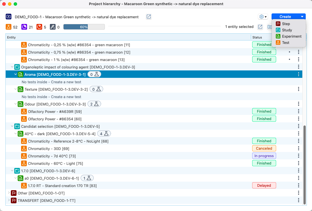
Here is, for comparison purposes, the old version and then some screenshots of the implemented version:
.png)


After implementing the changes in the new release, we expect a period of a little over a month of adaptation to measure the results. We chose to use the Customer Satisfaction Score (CSAT) to obtain user feedback. In addition to the question regarding satisfaction from 1 to 5, we have included an optional field to add any positive or constructive feedback for future improvements.

After collecting the responses, 75% satisfaction was obtained regarding the new Project Browser. It can be concluded that 3 out of 4 users were satisfied with the modifications.
Next Steps
- When obtaining feedback from the satisfaction survey, some points for improvement were identified. The most pertinent ones will be studied and implemented in the future.
- Maintain regularity in collecting user data, ensuring continuous improvement of the module.

